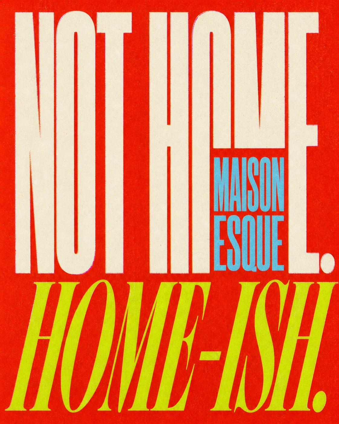
MAISON ESQUE
We built the first room.
Before there were products to reveal, MAISON ESQUE needed somewhere to exist. We treated maisonesque.com not as a holding page, but as the brand's first piece of architecture.
Visit maisonesque.com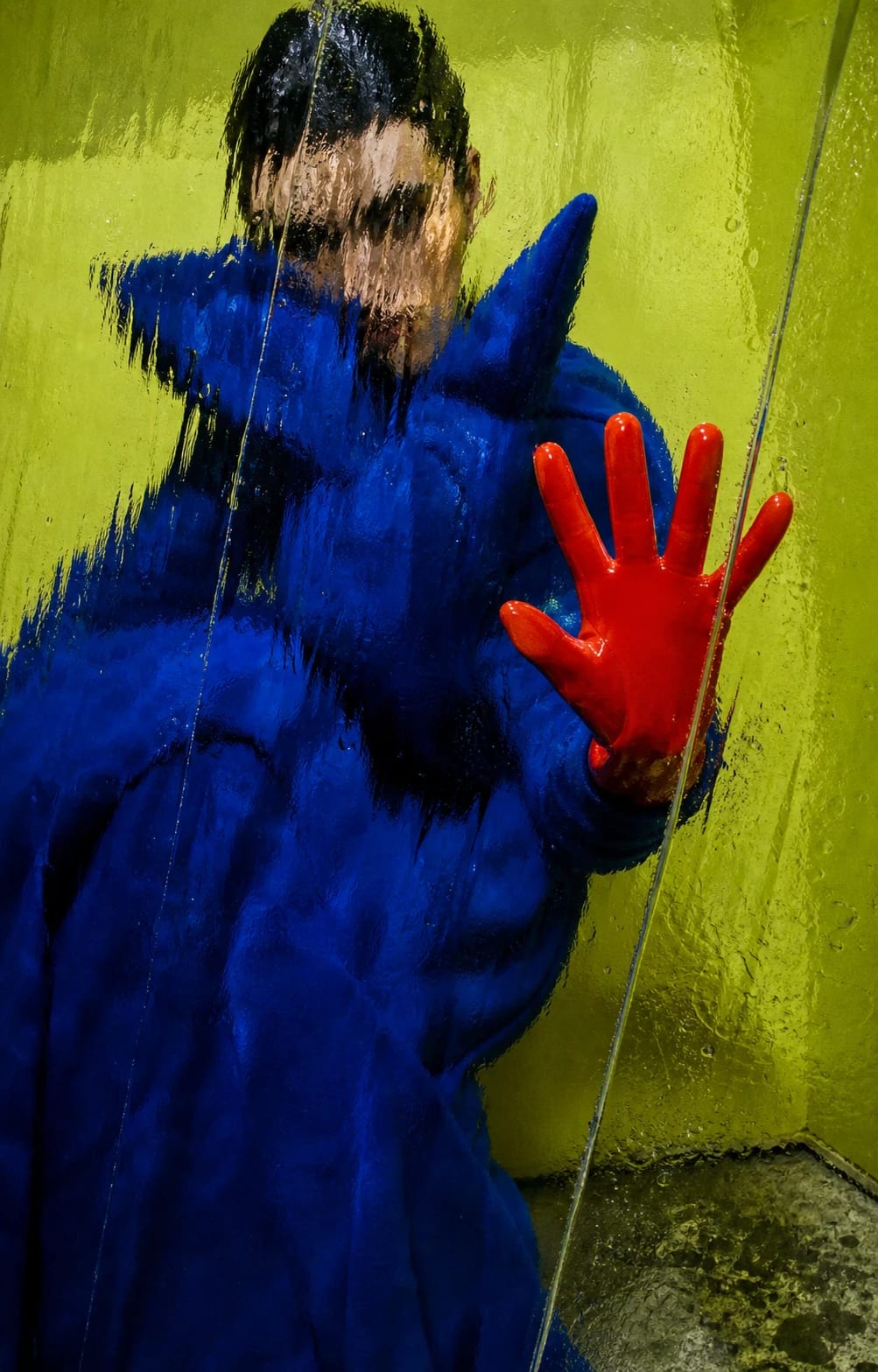
MAISON is the place.ESQUE is the possibility.
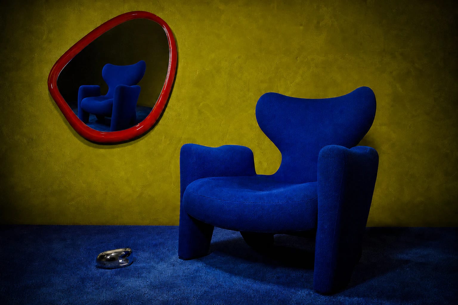
Familiar things, made to misbehave.
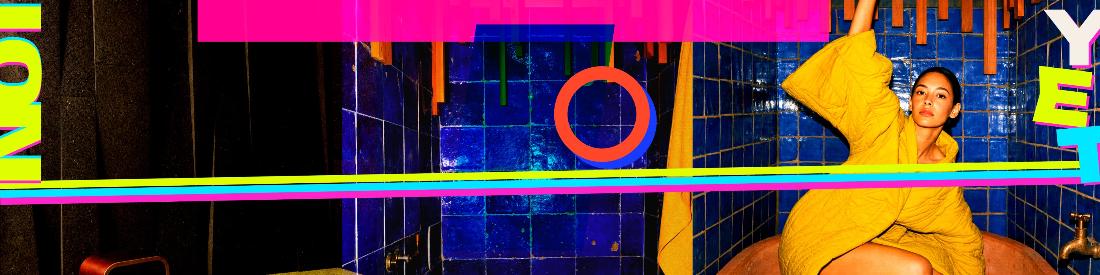
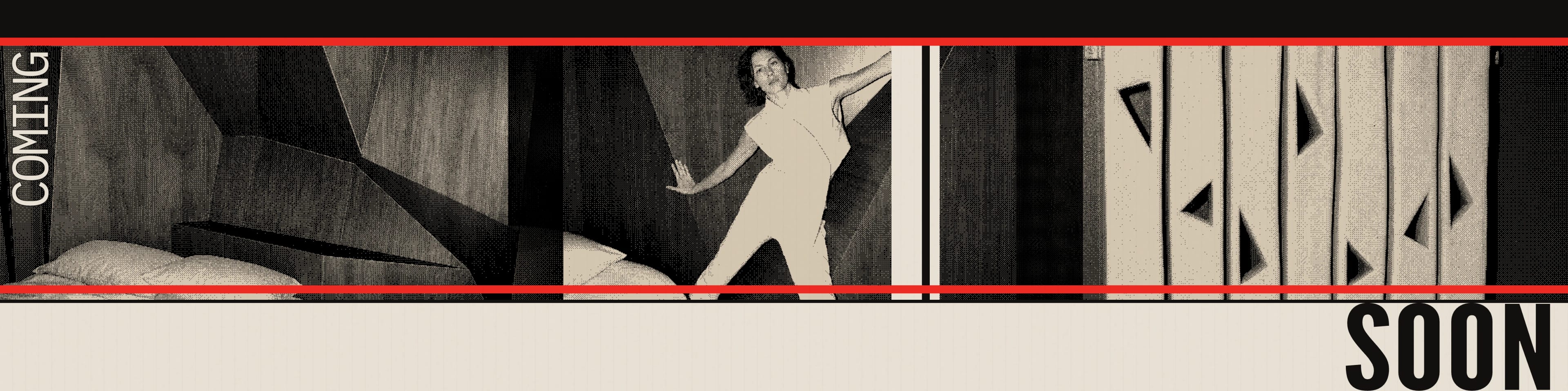
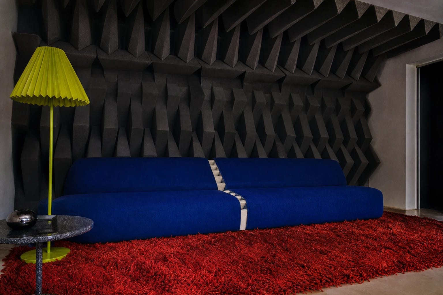
We wanted editorial precision without a polished, frictionless finish. Hard flash, awkward crops, rippled glass, carpet, gelatin, chrome, grain, dust, and visible seams gave the images their physical tension.
The palette does the same work. Bone and ink establish the house; cobalt, acid, and vermilion interrupt it. Every color is assertive, but the roles stay stable enough for the world to remain recognizable.
- Bone#ECE7DC
- Ink#0C0C0A
- Cobalt#1731DE
- Acid#D7FF00
- Vermilion#F04B2E
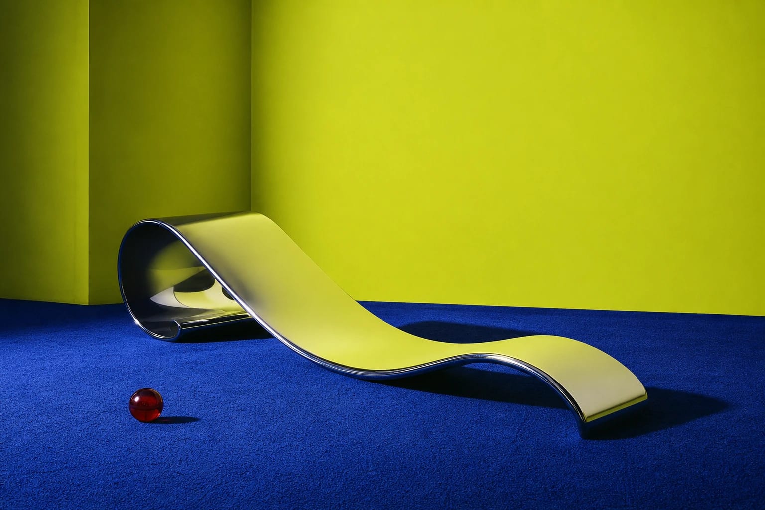
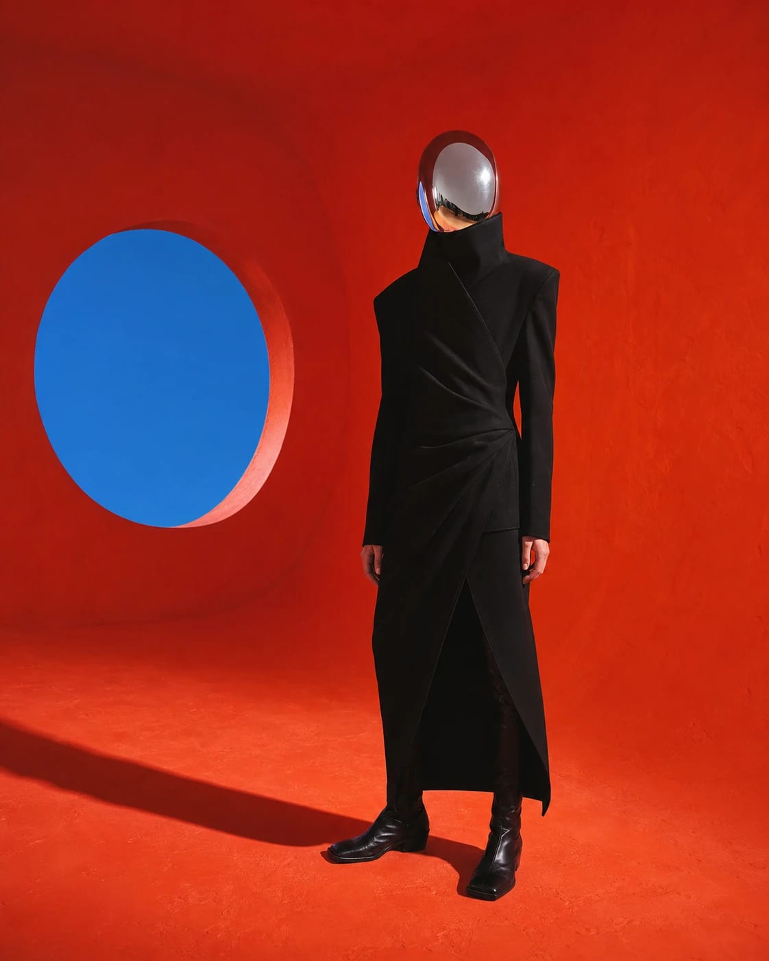
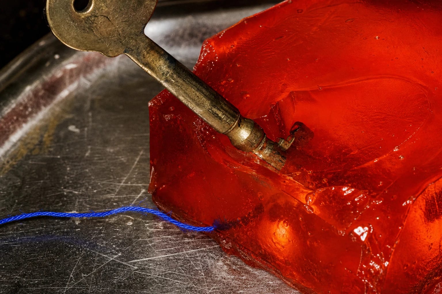
The house has bad manners.
The live experience does not wait politely at the door. It begins in motion, distorts the first image, holds rooms in place, lets proof cards be dragged and developed, then ends by asking for an address and offering a key.
Across repeated design passes, we removed the intro and opening cue, the opening caption, issue numbering, decorative rails, and ghost overlays. The work improved by subtraction: what remained was the part a visitor could feel.
Direction became a system.
Using workflows developed through KIANI AI, we turned an art-direction language into a repeatable production process: structured briefs, text-free source plates, controlled browser typography, continuous artboards, exact exports, and channel-ready handoff.
Set the world
Human direction established the premise, language, palette, materials, camera behavior, and everything the work must refuse.
Constrain the search
Structured briefs turned that direction into repeatable studies, defining physical detail, palette, composition, and negative constraints for each exploration.
Separate image from type
Text-free source plates kept the imagery clean. Real fonts and real words were composed later in the browser, where spelling, scale, and continuity could be controlled.
Select and refine
The workflows widened the field; we made the decisions. Final direction, selection, typography, interaction, implementation, and quality control remained our responsibility.
Publish precisely
Continuous master artboards, exact crops, alt text, channel notes, and saved source files turned a one-off campaign into a system that can be used again.
One world. More than one surface.
The website established the behavior. The campaign system carried it outward without reducing it to a logo and a color swatch.
The same source imagery and language moved through club and photostat treatments while retaining the same house. Each five-part story was composed on one uninterrupted 5400 × 1350 artboard, then cut at exact 1080-pixel boundaries. Continuity was designed in, not repaired at export.